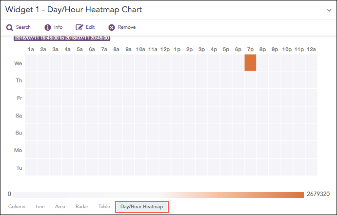
Heatmaps are used to visualize individual values contained in a matrix and represent them using different shades of a single color.
The Day/Hour Heatmap is an extension of a regular heatmap in which results are displayed in the day/hour format. It has seven rows and 24 columns. Each row represents a day of the week and each column represents an hour of the day. Therefore, each cell represents a single hour of a particular day.
The query format for the Day/Hour Heatmap is:
| timechart aggregation_parameter1 every 1 hour
Example:
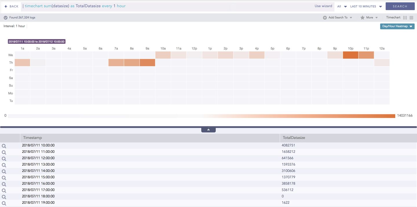
| timechart sum(datasize) as TotalDatasize every 1 hour
Day/Hour Heatmap for Timechart Single Aggregation without Grouping
The Day/Hour Heatmap chart supports a single aggregation response types for representation of search results in the visualization. It is :
Response Type |
General Syntax |
|---|---|
| timechart aggregation_parameter
|
The Day/Hour Heatmap only works for the Timechart Single Aggregation with Grouping response type with every 1 hour suffixed to the query.
The values of the aggregation parameter are displayed in the cells as per their timestamps.
The intensity of the color is dependent upon the relative value of the aggregation parameters.
Example:
| timechart sum(datasize) as TotalDatasize every 1 hour
Day/Hour Heatmap for Timechart Single Aggregation without Grouping
When the selected time range is more than a week, a slider appears on the right end of the container that allows the user to slide over the particular days.
You can refer to Timechart Single Aggregation without Grouping for more details.
You can assign custom colors to the Day/Hour heatmap for both positive and negative values. LogPoint uses the selected color to represent the maximum value of the data obtained, and lesser values have the same color with linear transparency.
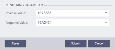
Rendering Parameters for Day/Hour Heatmap